My poster

Research
SHORT FILM POSTER - COLD
Cold:
 I have looked at the short film "cold" and identified how they present the genre of the film.
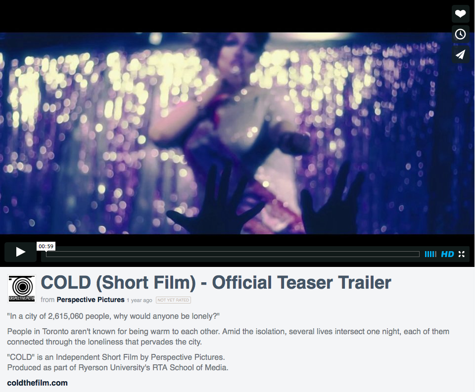
The film "Cold" was created by Ryerson University. When researching the film it appear difficult to find the film poster and it seemed that there wasnt one.
The producers of the film have used other methods to promote the film such as interviews. Film maker Waseem Shaikh has said that the film is set in "Toronto" where "several lives intersect. He also mentions that the film deals with feelings of "isolation" and "often deals with in gay circles". It was released for free online to assist with this promotion and is available on youtube, a popular and commonly used website to stream online media. The film is described as being set in toroto "in a city notorious for being cold to strangers"
 After
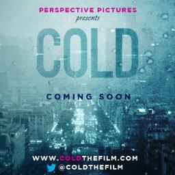
further research I have found that the producers have created a twitter
page where I have finally found their poster for the film.
After
further research I have found that the producers have created a twitter
page where I have finally found their poster for the film.
The most prominent word in the poster is the title of the film "COLD". The font is bold and eye catching; colours used for the font are in keeping with the theme of blue used in the background. This is also done with the font that reads "coming soon" which is set apart to draw attention by using a different shade of blue. The genre of the film is clearly shown with the use of these various shades of blue. This colour has connotations with cold weather such as rain which further conveys the genre of the film. On the poster there is evidence of noise from water marks created by frost or snow suggesting that the poster itself is cold and has been affected by this. The background used doesnt feature humans which are emotive by nature. Instead the background features buildings which would be considered unfeeling and cold. Thus the background is also in keeping with the message of the film.
Websites:
COLD teaser trailer
COLD full short film
Interview
Twitter
I have looked at the short film "cold" and identified how they present the genre of the film. The film "Cold" was created by Ryerson University. When researching the film it appear difficult to find the film poster and it seemed that there wasnt one.
The producers of the film have used other methods to promote the film such as interviews. Film maker Waseem Shaikh has said that the film is set in "Toronto" where "several lives intersect. He also mentions that the film deals with feelings of "isolation" and "often deals with in gay circles". It was released for free online to assist with this promotion and is available on youtube, a popular and commonly used website to stream online media. The film is described as being set in toroto "in a city notorious for being cold to strangers"
After
further research I have found that the producers have created a twitter
page where I have finally found their poster for the film. The most prominent word in the poster is the title of the film "COLD". The font is bold and eye catching; colours used for the font are in keeping with the theme of blue used in the background. This is also done with the font that reads "coming soon" which is set apart to draw attention by using a different shade of blue. The genre of the film is clearly shown with the use of these various shades of blue. This colour has connotations with cold weather such as rain which further conveys the genre of the film. On the poster there is evidence of noise from water marks created by frost or snow suggesting that the poster itself is cold and has been affected by this. The background used doesnt feature humans which are emotive by nature. Instead the background features buildings which would be considered unfeeling and cold. Thus the background is also in keeping with the message of the film.
Websites:
COLD teaser trailer
COLD full short film
Interview
SHORT FILM POSTER - HIGH MAINTENANCE
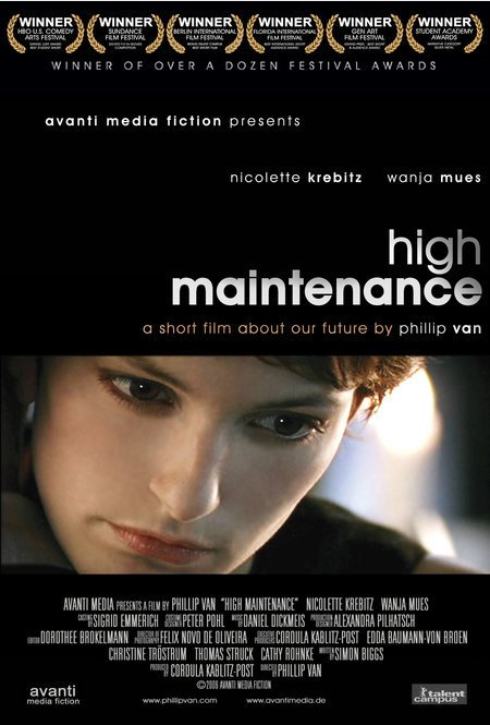 The
genre of the short film "high maintenance" would be drama and romance;
these genres are displayed within this poster in various ways.
The
genre of the short film "high maintenance" would be drama and romance;
these genres are displayed within this poster in various ways.The predominant colour in this poster is seen in the background which is black. By using this dark colour the genre of drama is conveyed as it creates an eerie tone.
The image included in the poster is made a focus point in the poster. This image is set apart from the rest of the poster because it involves more colours. The black and white within the rest of the poster assists in making the photograph bold and eye-catching. Within the photo, the woman looks fairly serious and the close up creates a sense that she is something to look at. Her beauty is used to create a sense of romance. The colour red has connotations with love and romance therefore the red of her lips would suggest this genre.
The close up is also used as it allows the audience to focus on the characters emotion. The audience is likely to pick up that the character in this close up is who the story in the film focuses on. The lighting used also helps to make her look beautiful as it gives the effect that she is glowing. Not only does this add to her beauty but it also, again, helps to show that she is the focus of attention within the film.
Websites
RESEARCH: SHORT FILM POSTER - FILL ME IN
The film poster for the short film "Fill Me In" is used to convey the genre of the film. The audience are informed about genre of the film in various ways. The focus of attention is on the characters who are featured on the poster and are a large part of the poster itself. The characters are clearly the main focus point of the poster as the image is large and the characters are dressed in bold patterns that vary from colours in the rest of the poster. White is the predominant colour as it is used in the background. Use of this colour helps to make the image of the characters stand out and it draws attention to them.The sense of drama is created through the body language of the characters. The image works with the stereotype that women fight over men as the male is placed standing between the two female characters. One of the female's is leaning on the male and her body language suggests a sense of romance. The female positioned to the right of the couple appears troubled by the behaviour and her gaze is set on the male again showing that the focus is on the male. The use of the two female characters and one male immediately created the idea for the audience that there is a sense of romantic drama occurring in the story.
The text used is designed in a way that links with the title of the film itself as the font used appears to be filled in or coloured in with pen. The colour red is used for the title of the short film as well as a question featured at the top of the poster where the audience will be drawn to the image of the three people. The colour red has connotations with romance as well as danger which signals to the audience again that this is a dramatic piece. Specific language such as the personal pronoun "you" is used to personally address the audience which is engaging and helps to grab the attention of the audience. Use of a rhetorical question "would you give him a second chance?" not only engages the audience but also conveys the drama of the short film as the audience is made aware that there is an issue. The word "him" shows the audience that the male is at fault; featuring the male with two females suggest romantic drama. Stereotypically men are considered unfaithful which is shown within this poster.
SHORT FILM POSTER - THE CRUSH

The audience are able to identify that this boy is a key character in the film because he is included with the title of the film and he is the only person seen in the image.
The lighting used in the poster creates a dream like effect that is linked with the body language of the young boy. His body language indicates that he is concentrating or focused on something. The words "The Crush" would suggest that the boy is day dreaming. The audience would associate his body language and facial expression with day dreaming or perhaps concentrating on something other than his work as he is seen in a relaxed position and not looking at his work. The word crush however shows that he is likely to be focused on the person he is attracted to. He appears to be day dreaming. The lighting also helps to focus on the boy who appears to glow. The bright white lighting could be associated with innocence.
The poster was found on an article from the BBC website . The film seemed to lack promotional websites and tools and the poster was difficult to find. This is unusual as it is common for films to have promotional material that is easy to find. The film premiered at the Kerry Film Festival. The short film was written and directed by Michael Creagh and produced by Damon Quinn.
Planning/Construction
I started out by having a photoshoot as a group. This enabled me to take
various pictures at different angles. From here I was able to select a
background image. I wanted to merge the photograph with an image of me
following a trail. To create this I took another image in which I was
crouching holding some post it notes. I then edited this in photoshop
removing the background.
After this I filled the image with a colour. When i placed it on the
main background I felt it looked too strong and so I altered the opacity
so it wasnt as harsh. I then added some shapes that could look like
post it notes and arranged them in various positions. In the first draft
I was creating they were yellow so as to make it clearer however I
didnt like this as much as it it blended in with the title too much.

In this version I also experimented with heart shapes and with font for
coming soon. I also put the title in the centre of the image where the
image faded into the white base. I stated to consider that I would
prefer to have the image more zoomed in and I wanted to make the opaque
image more central so that the photo faded into the post it trail.
In the final draft shown above I have moved the title to the top of the
poster to make it bold and very obvious. I also managed to get the
effect I wanted with the post it trail and the photograph. It made the
poster more interesting to look at and it creates some interest with the
audience as they may be intrigued by what it happening.
I have created my own text at the bottom of the poster so that it has
features of a real film poster. Here, there is small print explaining
roles in the film including producers, directors and actors.
I decided I wanted to make the date for the film a lot clearer and so in
the final draft I have made it bold and also included the month it will
be released rather than stating that it will be out in the "summer". I
have also included featres that involve and engage an audience such as a
website "www.checkoutshortfilm.co.uk" and also symbols to show that the
film is on social media sites.
This is a well planned response to the film poster brief. You have researched the genre and, in your close analysis on 4 short film posters, you show secure knowledge of genre conventions. Your finished poster reflects this understanding:
ReplyDeleteyou include all necessary institutional information, with appropriate font choices;
your layout makes a convincing poster;
your composition is creative and appeals to your target audience;
your poster signals its romantic genre effectively with its tagline, its Post-Its, its composition of attractive young characters and its bright colours;
and above all it clearly promotes the film by featuring the central characters. Most impressive of all is the creativity that has gone into its design, with the silhouetted mystery man at the bottom. Excellent work that is completely convincing as a film poster.