Sunday, 7 December 2014
Thursday, 4 December 2014
PLANNING: RISK ASSESMENT
Today I have considered what risks are involved when we are filming scenes for our short film. There are various risks we have to consider and prepare for so that people are safe when we film. The following are risks I have identified and that we need to be cautious about:
- Burning skin due to the hot arteficial lights
- Tripping over wires from the arteficial lights
- Broken glass - we used glass items such as wine glasses and had to be aware that caution must be taken as broken glass is a hazard
- Allergies - we must check if people are allergic to anything before we film at a students house
- Heavy equipment could injure people if it falls or isn't carried properly
- Electric shocks from water being around electrical
- Driving to the locations must be done with care
- Electrical equipment around water
Sunday, 23 November 2014
Thursday, 20 November 2014
CONSTRUCTION: RE-FILMING GIRL'S BEDROOM SCENE
When filming the scene in the girl's bedroom we wanted to use a variety of camera angles to show experimentation and make the footage interesting for viewers.
To begin the scene, we started with a close up shot and used a camera pan to represent and construct the setting; the camera showed a variety of makeup and the reflection of the female character in the mirror. As the main character in the scene. I had to move my hand across the makeup to show my thought process about getting ready for a date.
The camera techniques used in the first scene included a close up and an over the shoulder shot which showed my reflection in the mirror whilst applying makeup. This also helped to involve the audience on a personal level and made for a more interesting shot.
We used a crane shot was then used to show me reading a book. This set the scene and enabled the audience to get a feel for my character's emotions as I appear relaxed. I had to speak on the phone to a friend in this scene as this will allow the audience to follow the story line. By speaking to my friend the audience is then able to have an insight into my thoughts and emotions about the male character.
The camera techniques used in the following scene included a mid shot where my upper body can be seen up to my shoulders. In this shot my hair is the center of focus as it is long and I am seen to flick it and mess with it whilst in my outfit for the date. The audience is able to follow what has happened as when on the phone I am heard saying i have to "get ready". An over the shoulder shot which showed my reflection in the mirror whilst brushing down my dress and making sure I am ready to leave. This also helped to involve the audience on a personal level and made for a more interesting shot.
Tuesday, 4 November 2014
CONSTRUCTION: FILMING LIBRARY SCENE
I have used the presentational tool Visme here to show the process of the filming within the library.
Friday, 31 October 2014
PLANNING: CALL SHEETS
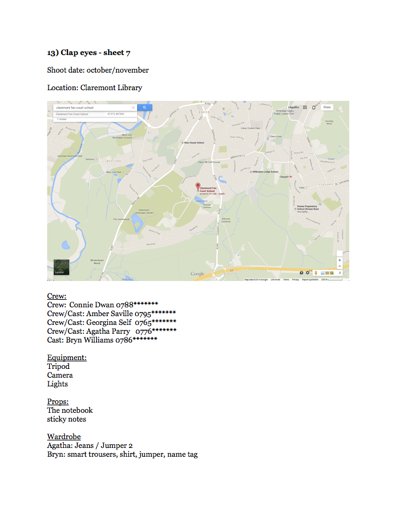
Below are screen shots of call sheets I have created. We had to use call sheets in our group as a basis for planning our shoots and it worked well as it helped us to keep organised. By using call sheets we've been able to plan out props and shoot dates as well as making sure that people knew what they needed to bring or where they should be.
Wednesday, 15 October 2014
RESEARCH: ANALYSING RADIO ADVERTS - DOCTOR WHO
Having looked at and analysed example of radio adverts from the 1970s, I'e decided to also analyse more modern day radio adverts. I wish to be able to find out the key information that should be displayed in these types of adverts and what has changed between older and more modern radio adverts so that I can include information that is necessary and effective.
In the radio advert for doctor who it has followed a very similar pattern to those of the 1970s. It used voice overs, sound effects and music to advertise the genre of the film. The beginning consisted of the use of a recognisable sound effect which represented the "Tardis". This immediately helped the audience to associated the sound with doctor who and can help to grab people's attention. The voice over used was from one of the main characters who narrates the advert offering he insight into her own character and the relationship between herself and the doctor. She does not however explain the storyline in detail in the way that some of the 1970s adverts did. "The doctor" is repeated and mentioned as well as the name of the female characters narrating "I'm clara Oswald" however the official title of the television drama isn't introduced until later in the advert where a different narrator is used. This change in voice has enabled the first narrator to stay in character and create drama and excitement however the second voice displays clear information about the programme such as: "on BBC 1" and "Saturday at 7.
Genre is established through music which creates dramatic tense feel as well as the speech and the sci-fi sound effects used. As well as this, the theme tune for the television series accompanies the second narrator and there are bites of audio from the television series being included within the advert to add depth to the story. The audio creates excitement and tension as shouts can be heard.
RESEARCH: ANALYSING RADIO ADVERTS - SUPERMAN
I have listened to the radio advert for the film Superman (1978). I have been able to identify common features found in radio adverts.
The narrator used helps to grab the attention of the audience. A relationship is built with the audience through synthetic personalisation. The narrator states "nothing you have ever seen heard or imagined could ever prepare you for this reality", the use of the personal pronoun "you" helps to build this personal relationship with the audience. There is a strong and over dramatic description of the film such as "brought to you by the awesome technology of modern film and "the man and the story are as real as you are". Not only does this grab the attention of the audience but it helps to establish the tone and key genre of the film as it appears dramatic and action packed. The music assists in creating this sense of action and adventure as it is dramatic and in places and is a type of music that is very stereotypically used with action or hero movies. Super is now the movie - here there is an assumption that superman is known by the audience suggesting that the audience is viewed as being very broad.
As well as this, the advert features a tag line "you'll believe a man can fly" which allows consumers to make a connection between the poster and the film tying together all promotional aspects of the film. The title of the film "Superman" is repeated at various points in the advert to reinforce this to the audience. There is also, again following the pattern of radio adverts, information on when and where to see the film, "now at selected west end and suburban cinemas", and the rating "certificate A".
RESEARCH: ANALYSING RADIO TRAILERS - APOCALYPSE NOW
I have also looked at the radio trailer for the film "Apocalypse Now". The speech at the beginning is not accompanied by music. The music is eased in gradually as it is loud and bold. It is introduced after the first part of dialogue where the film title is stated. This emphasises the release of the film and the name of the film. The music used is key to demonstrating the genre of the film as the bold audio has an adventurous or thrilling tone to it. The dialogue at the begging of the radio advert appears to be audio from the film which helps to portray the film in an appealing way for an audience and to demonstrate the themes of the film. The mention of key actors names draws in audience and may also signal what genre the video is likely to be.
The voice over at the end of the radio advert features key information such as the classification of the film, "certificate X", and where the film can be seen and when such as the dialogue "all over London from Sunday". There is also a voice over used at the end which works as a conclusion to the advert. It features a line that may be considered a tag line: experience apocalypse now and you will never need to go to war. There is also use of audio which gives insight agin into the genre of the film and is likely to have been taken from the film itself: "the horror" These words are repeated at the end and fade out to create drama and emphasis about the horror and thriller styled genre.
The voice over at the end of the radio advert features key information such as the classification of the film, "certificate X", and where the film can be seen and when such as the dialogue "all over London from Sunday". There is also a voice over used at the end which works as a conclusion to the advert. It features a line that may be considered a tag line: experience apocalypse now and you will never need to go to war. There is also use of audio which gives insight agin into the genre of the film and is likely to have been taken from the film itself: "the horror" These words are repeated at the end and fade out to create drama and emphasis about the horror and thriller styled genre.
Tuesday, 14 October 2014
RESEARCH: ANALYSING RADIO TRAILERS - FANTASIA
I have looked at the 1979 london radio advert for the film Fantasia. The radio advert follows a specific pattern of an introduction, the use of voice overs and music.
In the radio advert for Fantasia, there is an introduction which includes the use of a voice accompanied by classic music. The film name is immediately introduced with a factual selling point: "In full stereophonic sound: Fantasia!". The sound of the string instruments is effective as specific parts of the music are louder and more bold. The upbeat tune in the background builds suspense as it gradually becomes stronger.
The music assists in establishing the genre of the film. It is fast paced and upbeat, the sound of the string instruments almost becomes hurried and muddled together to create a fantasy feel. The upbeat tone to the music suggests that the film could be aimed at a younger audience. The voice over also confirms this due to the mention of "Walt Disney's Fantasia" which wil be associated with children's animations and productions. The speech also develops the plot and genre of the film: "where colour and shape merge with the worlds most beautiful music". This conveys a musical, fantasy based film.
The conclusion of the radio advert features another voice over with a different narrator. Change in the voice here signals that the information being given has a different purpose. Key information is coveyed by this new narrator which features towards the end of the advert. The information conveyed here relates to where the film can be viewed: "an exclusive presentation, now showing at the Odeon Haymarket". The musical soundtrack can be heard to build to a climax towards the end of the advert to build the suspense and establish that this is the end of the advert.
RESEARCH: RADIO TRAILERS
 Today we investigated radio adverts used for films by looking at a playlist on YouTube entitled 1970s radio adverts for cult movies. This playlist has been a brilliant source for me as it allowed me to view a range of radio adverts.
We also looked at the radio advert for the popular television show "Doctor Who". We analysed these and found that they follow a specific structure. This tends to include:
- an introduction
- use of voice overs and music that establish the genre
- introductory voice over which also specifies genre
- dialogue spoken by key character creating drama and suspense setting out key thiemes
- a musical soundtrack which accompanies dialogue building to a climax
- tag line taken from the film poster
- conclusion with another voice over provides key information about when the film opens, when the screenings take place and the certification
Sunday, 12 October 2014
TRELLO UPDATE 2
Today I updated my trello and have included screen shots below to show my progress. To be taken to a live version of my trello please click either of the images below.
Thursday, 9 October 2014
RESEARCH: SHORT FILM POSTER - THE CRUSH
The audience are able to identify that this boy is a key character in the film because he is included with the title of the film and he is the only person seen in the image.
The lighting used in the poster creates a dream like effect that is linked with the body language of the young boy. His body language indicates that he is concentrating or focused on something. The words "The Crush" would suggest that the boy is day dreaming. The audience would associate his body language and facial expression with day dreaming or perhaps concentrating on something other than his work as he is seen in a relaxed position and not looking at his work. The word crush however shows that he is likely to be focused on the person he is attracted to. He appears to be day dreaming. The lighting also helps to focus on the boy who appears to glow. The bright white lighting could be associated with innocence.
The poster was found on an article from the BBC website . The film seemed to lack promotional websites and tools and the poster was difficult to find. This is unusual as it is common for films to have promotional material that is easy to find. The film premiered at the Kerry Film Festival. The short film was written and directed by Michael Creagh and produced by Damon Quinn.
Wednesday, 8 October 2014
RESEARCH: SHORT FILM POSTER - FILL ME IN
The film poster for the short film "Fill Me In" is used to convey the genre of the film. The audience are informed about genre of the film in various ways. The focus of attention is on the characters who are featured on the poster and are a large part of the poster itself. The characters are clearly the main focus point of the poster as the image is large and the characters are dressed in bold patterns that vary from colours in the rest of the poster. White is the predominant colour as it is used in the background. Use of this colour helps to make the image of the characters stand out and it draws attention to them.The sense of drama is created through the body language of the characters. The image works with the stereotype that women fight over men as the male is placed standing between the two female characters. One of the female's is leaning on the male and her body language suggests a sense of romance. The female positioned to the right of the couple appears troubled by the behaviour and her gaze is set on the male again showing that the focus is on the male. The use of the two female characters and one male immediately created the idea for the audience that there is a sense of romantic drama occurring in the story.
The text used is designed in a way that links with the title of the film itself as the font used appears to be filled in or coloured in with pen. The colour red is used for the title of the short film as well as a question featured at the top of the poster where the audience will be drawn to the image of the three people. The colour red has connotations with romance as well as danger which signals to the audience again that this is a dramatic piece. Specific language such as the personal pronoun "you" is used to personally address the audience which is engaging and helps to grab the attention of the audience. Use of a rhetorical question "would you give him a second chance?" not only engages the audience but also conveys the drama of the short film as the audience is made aware that there is an issue. The word "him" shows the audience that the male is at fault; featuring the male with two females suggest romantic drama. Stereotypically men are considered unfaithful which is shown within this poster.
The text used is designed in a way that links with the title of the film itself as the font used appears to be filled in or coloured in with pen. The colour red is used for the title of the short film as well as a question featured at the top of the poster where the audience will be drawn to the image of the three people. The colour red has connotations with romance as well as danger which signals to the audience again that this is a dramatic piece. Specific language such as the personal pronoun "you" is used to personally address the audience which is engaging and helps to grab the attention of the audience. Use of a rhetorical question "would you give him a second chance?" not only engages the audience but also conveys the drama of the short film as the audience is made aware that there is an issue. The word "him" shows the audience that the male is at fault; featuring the male with two females suggest romantic drama. Stereotypically men are considered unfaithful which is shown within this poster.
Monday, 6 October 2014
RESEARCH: SHORT FILM POSTER - HIGH MAINTENANCE
 The
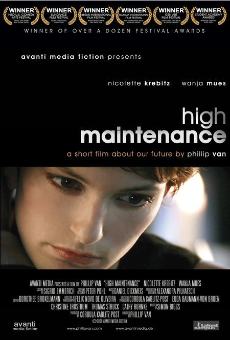
genre of the short film "high maintenance" would be drama and romance;
these genres are displayed within this poster in various ways.
The
genre of the short film "high maintenance" would be drama and romance;
these genres are displayed within this poster in various ways.The predominant colour in this poster is seen in the background which is black. By using this dark colour the genre of drama is conveyed as it creates an eerie tone.
The image included in the poster is made a focus point in the poster. This image is set apart from the rest of the poster because it involves more colours. The black and white within the rest of the poster assists in making the photograph bold and eye-catching. Within the photo, the woman looks fairly serious and the close up creates a sense that she is something to look at. Her beauty is used to create a sense of romance. The colour red has connotations with love and romance therefore the red of her lips would suggest this genre.
The close up is also used as it allows the audience to focus on the characters emotion. The audience is likely to pick up that the character in this close up is who the story in the film focuses on. The lighting used also helps to make her look beautiful as it gives the effect that she is glowing. Not only does this add to her beauty but it also, again, helps to show that she is the focus of attention within the film.
Websites
RESEARCH: SHORT FILM POSTER - COLD
Cold:
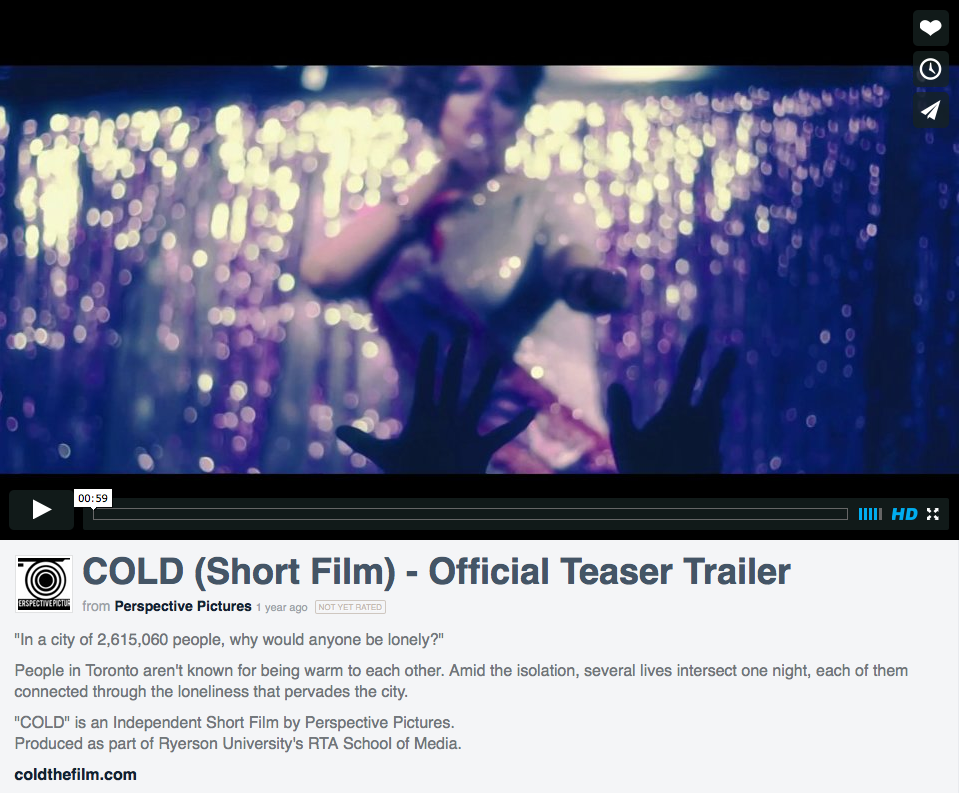 I have looked at the short film "cold" and identified how they present the genre of the film.
 The film "Cold" was created by Ryerson University. When researching the film it appear difficult to find the film poster and it seemed that there wasnt one.
The producers of the film have used other methods to promote the film such as interviews. Film maker Waseem Shaikh has said that the film is set in "Toronto" where "several lives intersect. He also mentions that the film deals with feelings of "isolation" and "often deals with in gay circles". It was released for free online to assist with this promotion and is available on youtube, a popular and commonly used website to stream online media. The film is described as being set in toroto "in a city notorious for being cold to strangers"
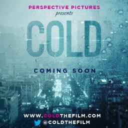 After further research I have found that the producers have created a twitter page where I have finally found their poster for the film.
 The most prominent word in the poster is the title of the film "COLD". The font is bold and eye catching; colours used for the font are in keeping with the theme of blue used in the background. This is also done with the font that reads "coming soon" which is set apart to draw attention by using a different shade of blue. The genre of the film is clearly shown with the use of these various shades of blue. This colour has connotations with cold weather such as rain which further conveys the genre of the film. On the poster there is evidence of noise from water marks created by frost or snow suggesting that the poster itself is cold and has been affected by this. The background used doesnt feature humans which are emotive by nature. Instead the background features buildings which would be considered unfeeling and cold. Thus the background is also in keeping with the message of the film.
Websites:
COLD teaser trailer
COLD full short film
Interview
Friday, 3 October 2014
PLANNING: FINAL STORYBOARD
Today, we worked as a group to create our final story board so that we can plan out our scenes for filming. We can now easily establish our plot to ensure that it incorporates codes and conventions of short films, such as a plot twist, so that our story makes sense and will flow well. We can see which scenes need to be filmed and which actors are necessary for this. We have been able to start making our call sheets as another way to manage ourselves and out time.
Thursday, 2 October 2014
RESEARCH: RECCE RESTAURANT SCENE
Today, I looked for a venue for the restaurant scene of our short film. The area works well as it can be used to set up an outdoor eating area. I think the location works well for the scene as there are doors leading to the eating area that could be used to set the scene as a restaurant. I have considered replacing the bench with a smaller table as it will create a more realistic romantic scene. I feel that the location will work well for the romantic scene as it is reasonably quiet and is less open. This will help to create the intimate tone to the dinner date. The location is near to a kitchen which may be good when filming our establishing shots. The space int he scene allows us to have shots that will be uninterrupted by unwanted background objects.
 |
| This shot depicts a possible camera angle we could use. It would be a good establishing shot to reinforce the idea that the scene is in a restaurant. |
 |
| this is a shot of the bench taken from above demonstrating the space available and the possibility of a camera angle that could be used in our film. |
Wednesday, 1 October 2014
RESEARCH: SHORT FILMS ON TELEVISION
Today I have researched more about where short films are displayed. Short films, whilst often displayed at short film festivals, are also shown on television or online on television websites.
When looking at various on demand sites such as Channel 4 there are various short films that can be viewed online. BBC iPlayer is commonly used to catch up on programmes that have originally aired on the BBC channel on television. Therefore it is clear that short films are not only distributed online. The BBC Network is a site specifically dedicated to showcasing short films: "Watch the best new movies from UK filmmakers. Film Network screens short films , promotes the UK movie industry and provides a social network of filmmaking"
 |
| [short films available for viewing online on the Channel 4 website] |
 |
| [BBC Film Network site where an audience can find a "social network" of short films] |
 |
| [Short films available online on BBC iPlayer] |
 |
| [Short animated film available online on BBC iPlayer] |
Tuesday, 30 September 2014
PLANNING: TRELLO UPDATE 1
I have been updating my Trello and completing tasks that I have to do for my course. It has helped me to keep track of tasks and stay organised. Below shows a screen shot of the progress I have made so far which is shown within the list on my Trello. To go to my live trello please click below.
RESEARCH: DIRECTORS LABEL & CINEMA16
Cinema16
Cinema16 is a small British DVD company who release "classic & award winning short films on DVD".
Cinema16 is a small British DVD company who release "classic & award winning short films on DVD".

Their compilations released include short films from famous directors including Ridley Scot, Tim Burton , Mark Leigh and George Lucas. Cinema16 also features work created by less well known directors. As well as this, their films also feature commentary tracks (usually by the director).
- British Short Films
- European Short Films
- US Edition of European Short Films
- American Short Films
- World Short Films
Directors Label
Directors Label is a series of DVDs that showcase the work of various directors of short films, music videos and video art. It was first released in 2003 by Palm Pictures and the series was created by directors Spike Jonze, Chris Cunningham and Michel Gondry who are the subjects of the first three volumes. Short films are often showcased at film festivals howeverDVD's are considerably better as they can be viewed repeatedly. They are often considered as better platform than film festivals.
Directors Label is a series of DVDs that showcase the work of various directors of short films, music videos and video art. It was first released in 2003 by Palm Pictures and the series was created by directors Spike Jonze, Chris Cunningham and Michel Gondry who are the subjects of the first three volumes. Short films are often showcased at film festivals howeverDVD's are considerably better as they can be viewed repeatedly. They are often considered as better platform than film festivals.
websites
cinema16 official site: http://www.cinema16.org/home.php
cinema16 information: http://en.wikipedia.org/wiki/Cinema16
directors label information source: http://en.wikipedia.org/wiki/Directors_Label
cinema16 information: http://en.wikipedia.org/wiki/Cinema16
directors label information source: http://en.wikipedia.org/wiki/Directors_Label
RESEARCH: SHORT FILM FESTIVALS
Short film’s are often screened in film festivals. Examples of film festivals include:
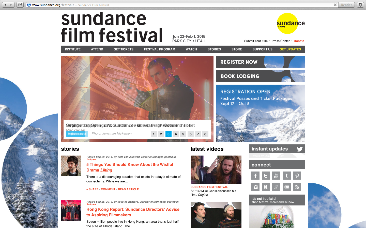
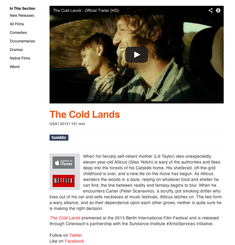
Sundance Film Festival

- Sundance Film Festival (January 22 - february 1st, 2015) is an American film festival taking place annually in Utah
- began in Salt Lake City in August 1978
- In 2012 46,731 people attended the festival
- It's one of the largest independent film festivals in the United States

- The Sundance festival enable people to access videos online
- The festival enables new directors to showcase their work both at a festival and online where videos are often very successfully shared
- short films are helpful for people who create short films as a promotional method, for example, for the purpose of charity events
- the festival encourages people to watch short films both at the festival and online through "Netflix" and also through "YouTube" where trailer's and clips of film's are featured
RESEARCH: LIFE IN A DAY (2011 FILM)
Why we looked at the film "Life in a Day":
I have looked at the film "Life in a Day" as it is a part of our research into the genres of short film. I have been looking at the video from an artistic and institutional point of view.
About the film:
The film is an example of crowdsourced drama/documentary film meaning that it was made from a collection of video clips made by the general public from all around the world on a single day. The duration of the film is 94 minutes and 53 seconds long. It was directed by Kevin Macdonald and debuted at the Sundance Film Festival on January 27th, 2011. The premier was streamed live on youtube; on october 31, 2011, YouTube announced that the full length film would be available for free on their website as well as on DVD. Therefore the film's distribution methods would be considered unconventional. Film posters were used to advertise to a larger audience which demonstrates a conventional method.
Ridley scott
 |
| [Example of close ups used in the film] |
 |
| [Example of low shot as well as handheld/phone camera used in the film] |
- Scott was responsible for the editing of the film
- close ups were very common as well as low shots and use of relections and mirror shots.
- The quality of the footage suggests that a lot of filming was handheld - many were likely to be using mobile phones.
- Scott has also included lots of cuts within the film including match cuts as well as the used of pull focus
- scott's editing has established the scene and the mood - when the viewer's see poverty the sound used is upbeat or hopeful
- Scott's work was based around a particular structure. This structure was that the film would show a full day from dawn to dusk.
- Scott used a lot of speeded up filming which has established the scenes such as can be seen below:
 |
| [Speeded up filming/editing is shown above as the clouds clear gradually in these shots] |
Convergence
- The film demonstrated convergence. This is the coming together of varying software/technology - we no longer just consume, we are considered producers as well. This shows the technological development of the modern day. Web 2.0 enables this as a more updated and organised version of the world wide web.
- The film would not have bee possible 10 years ago or do as people had neither the knowledge nor the technology to create there own footage for this sort of project.
- The film "couldn't have been made without technology. Ten years ago it wou;'ve been impossible" (Joe Walker, date July 29th 2011)
- Michael Wesch highlights how he refers to this as "participatory culture" which is explained in a youtube video entitled "We are all producers" another example of a crowd sourced film:
 |
| Screenshots from the video: "We are all producers" |
Websites:
Joe Walker - "Life in a Day Distills 4,500 Hours of Intimate Video Into Urgent Documentary" (WebCite archive),
Michael Wesch - https://www.youtube.com/watch?v=B73hbpeJXFs
Thursday, 25 September 2014
PLANNING: OUR SHOT LIST
Below shows our final storyboard which we have worked on since creating a rough storyboard/shot list. It will be helpful in organising our group and keeping track of what is required for our film. It demonstrates each separate scene that we will be filming as well as props, actors and we have also included notes with extra relevant information such as camera shots.
A2 ADVANCED PRODUCTION SHORT FILM SHOT LIST
CHECK OUT
SOUND
|
VISION
|
ACTORS
|
PROPS
|
NOTES
|
A woman goes into a library and she is searching the romance area which makes it clear that she is interested in the topic.
|
Agatha
|
Library Sign
|
Tracking shot
|
|
Dialogue:”some people are so rude” to the nice guy
|
As she is queuing someone nudges her rudely.
|
Agatha, Amber
|
The Notebook
|
Hand held camera (audience gets knocked with it)
|
“do you want a loyalty card”to show that she has a reason to come back to the same library
|
Gets served by nice guy
|
Bryn
|
Loyalty Card The Notebook
|
Over the shoulder Shot Reverse Shot
|
Reads the book fast which suggests that she is eager to go back to the library to see this boy.
|
Agatha
|
Clock
The Notebook |
Establishing shot Wide Shot
360 camera movement showing morning till night |
|
Goes back to find sticky notes at the library and follows them around. Each one has a different compliment on them.
|
Bryn, Agatha
|
Sticky Notes
|
Tracking shot as she searches for the sticky notes around the library
|
|
“got my notes I see”
|
Checkouts her book by player
|
Player
|
Romeo and Juliet
|
Over the shoulder Close up of her holding Romeo and Juliet
|
She agrees to date him
|
Agatha, Player
|
|||
Shows her speaking to a friend about the player
|
Agatha
|
Phone Makeup Jewellery
|
Reflection in the mirror; getting ready.
|
|
Camera shows player checking other people out at the restaurant
|
Agatha, Gina
|
Restaurant and restaurant food etc
|
Pull of focus from the girl to the waitress
|
|
Goes back to library and picks up sticky note
|
Agatha
|
Sticky Notes
|
||
Sees player with another girl
|
Agatha, Amber
|
Tilt up
|
||
Drops sticky note
|
Agatha
|
Sticky Note
|
Slow motion of sticky note falling
|
|
Both her and nice buy bend down to get her sticky note together and touch hands
|
Agatha, Bryn
|
Sticky Note
|
||
“I see you got my sticky notes”says Bryn
|
Clap eyes
|
Agatha, Bryn
|
Sticky Note
|
Close up
|
Subscribe to:
Comments (Atom)


