 The
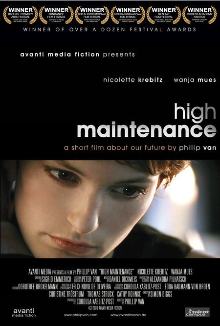
genre of the short film "high maintenance" would be drama and romance;
these genres are displayed within this poster in various ways.
The
genre of the short film "high maintenance" would be drama and romance;
these genres are displayed within this poster in various ways.The predominant colour in this poster is seen in the background which is black. By using this dark colour the genre of drama is conveyed as it creates an eerie tone.
The image included in the poster is made a focus point in the poster. This image is set apart from the rest of the poster because it involves more colours. The black and white within the rest of the poster assists in making the photograph bold and eye-catching. Within the photo, the woman looks fairly serious and the close up creates a sense that she is something to look at. Her beauty is used to create a sense of romance. The colour red has connotations with love and romance therefore the red of her lips would suggest this genre.
The close up is also used as it allows the audience to focus on the characters emotion. The audience is likely to pick up that the character in this close up is who the story in the film focuses on. The lighting used also helps to make her look beautiful as it gives the effect that she is glowing. Not only does this add to her beauty but it also, again, helps to show that she is the focus of attention within the film.
Websites
Good analysis of visual codes. Now add in the institutional information which have crucial conventions.
ReplyDelete